Case 03
UX Research · Product Design · 0 to 1 Project
Unified Student
Communication Hub
Students at UCC were drowning in five platforms to manage one degree. I researched the real problem, designed a unified solution, and validated it with 45 students bringing communication overload down by 80%.
Overview
The problem worth solving.
Students at UCC juggle Canvas, Gmail, WhatsApp, Teams, and Moodle just to stay on top of one degree. The fragmentation is not an inconvenience it is actively causing missed deadlines, increased anxiety, and cognitive fatigue that gets in the way of learning.
The problem hits hardest for international students navigating a second language and students balancing part-time work. But it affects almost everyone with a full course load.
"How might we reduce cognitive load and help students manage academic communication more effectively across multiple fragmented platforms?"
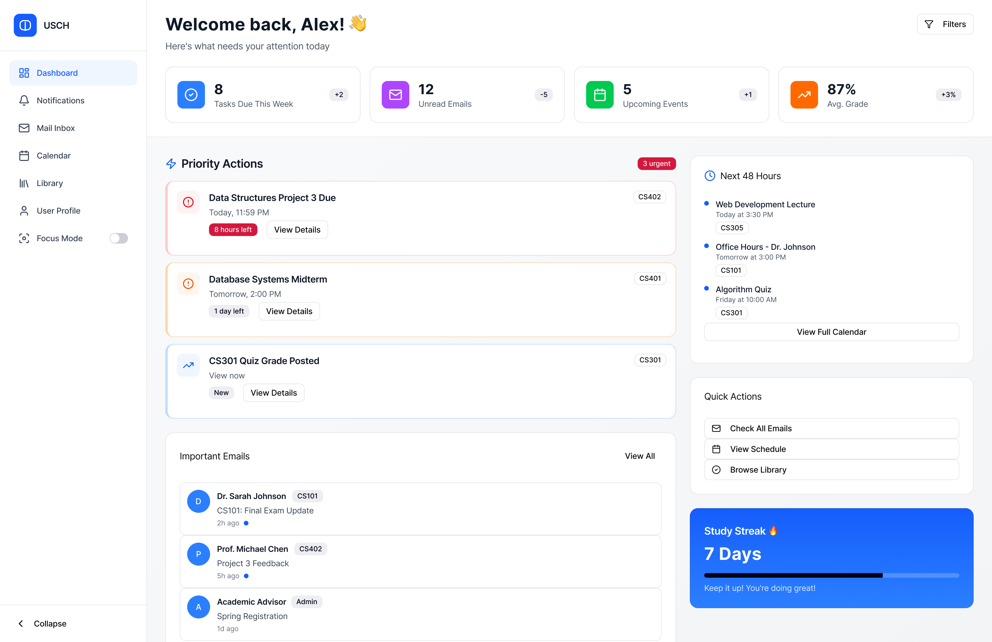
USCH Dashboard unified view with priority actions, upcoming events, and important messages
The Problem
Three pain points, one root cause.
Initial research showed the fragmentation was not just inconvenient it was causing real anxiety and affecting academic performance.
01
Platform Fragmentation
Messages scattered across Canvas, Gmail, Teams, and WhatsApp. No single source of truth for anything academic.
02
Notification Overload
Duplicate notifications and constant interruptions causing stress and cognitive fatigue throughout the day.
03
Missed Information
Important deadlines buried in noise. Directly affecting academic performance and increasing anxiety.
Research
Eight interviews, four findings.
I ran eight semi-structured interviews with UCC students from diverse backgrounds international students, working students, and mature students. The goal was to understand communication behaviour at depth, not confirm assumptions.
01
Communication Fatigue
Students check 4–6 different platforms daily. An average of 45 minutes spent managing notifications before any actual academic work.
02
Anxiety and FOMO
Fear of missing information leads to compulsive platform-checking and heightened stress, especially around deadlines.
03
No Prioritisation System
No clear way to distinguish urgent academic messages from general social notifications across any existing platform.
04
Redundant Messages
Same announcements appearing across multiple platforms causing confusion about which version is authoritative.
Personas
Three students, one shared frustration.
J
Jenny
International Student
Anxious about missing important information. Checks platforms compulsively. Language barriers add extra cognitive load to every notification.
D
Daniel
Working Student
Values efficiency above everything. Deeply frustrated by constant app-switching. Wants communication that respects his limited time.
A
Aisling
Mature Student
Organised but easily overwhelmed. Has started muting apps as self-protection but misses important updates as a result.
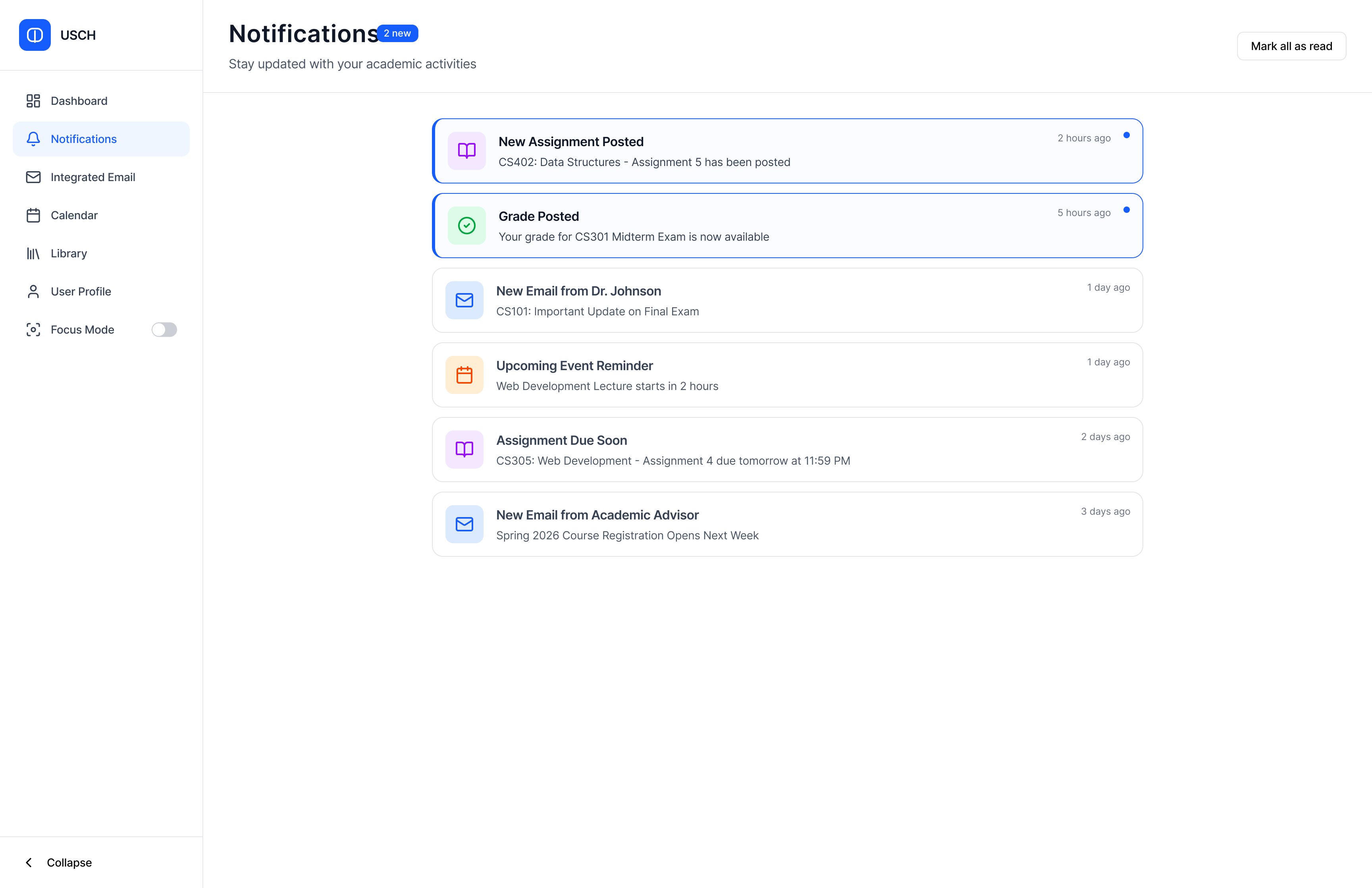
Priority notifications consolidated and categorised by urgency
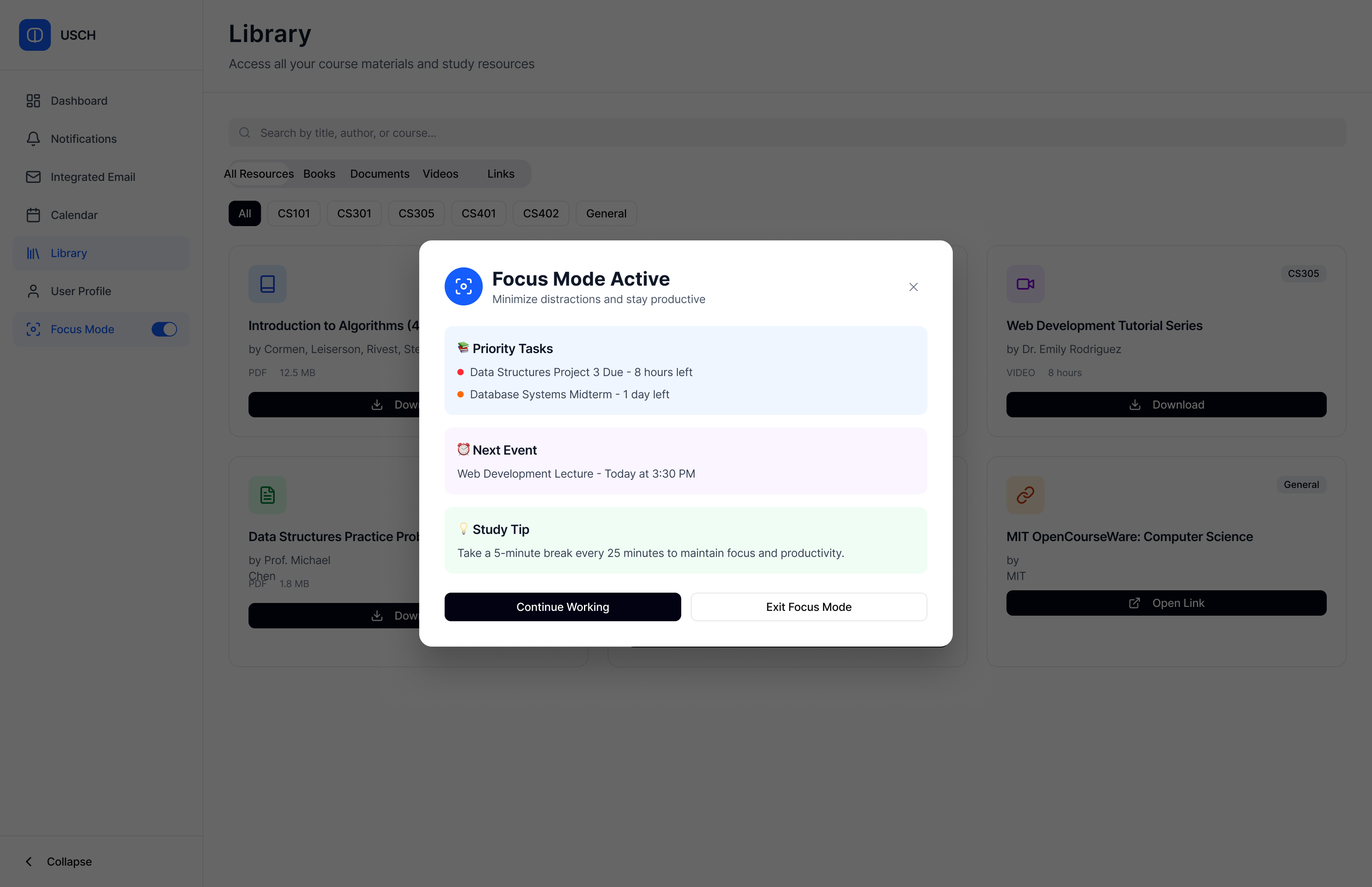
Focus Mode surfaces only urgent academic items when you need to concentrate
Design Process
Research first. Prototype second.
Every design decision was grounded in the research. I moved through four phases and iterated on each before advancing to the next resisting the urge to jump to solutions before understanding the problem fully.
01
Lo-Fi Wireframes
Structure and functionality without visual bias.
02
Mid-Fi Prototypes
Refined hierarchy and user flows from early feedback.
03
Hi-Fi Mockups
Visual design system applied in Figma.
04
Usability Testing
45 students, 2 moderated rounds, iterated after each.
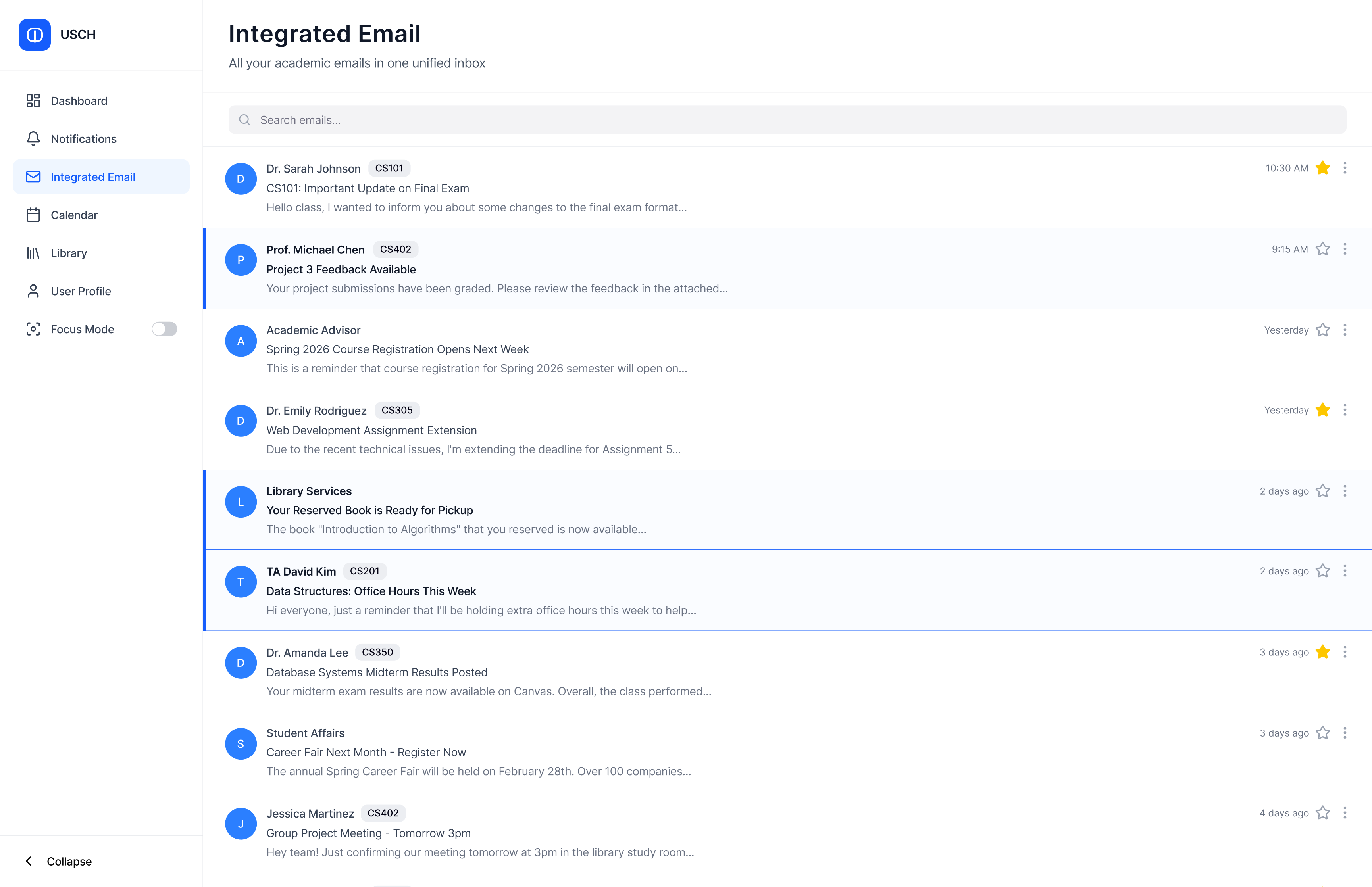
Unified Email Inbox all academic communication in one place
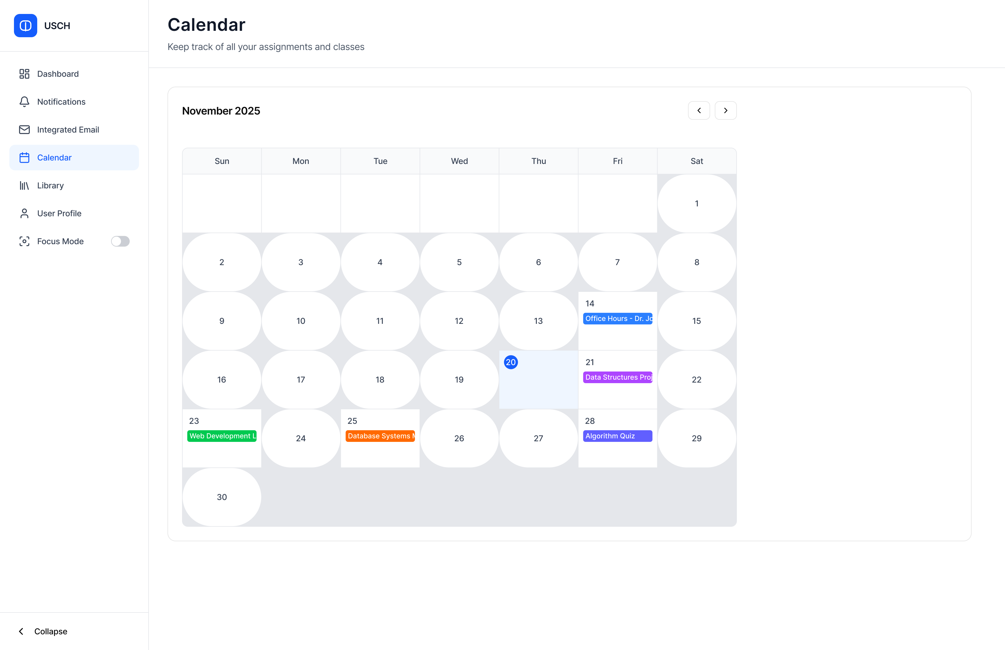
Integrated Calendar deadlines, events, and messages in one view
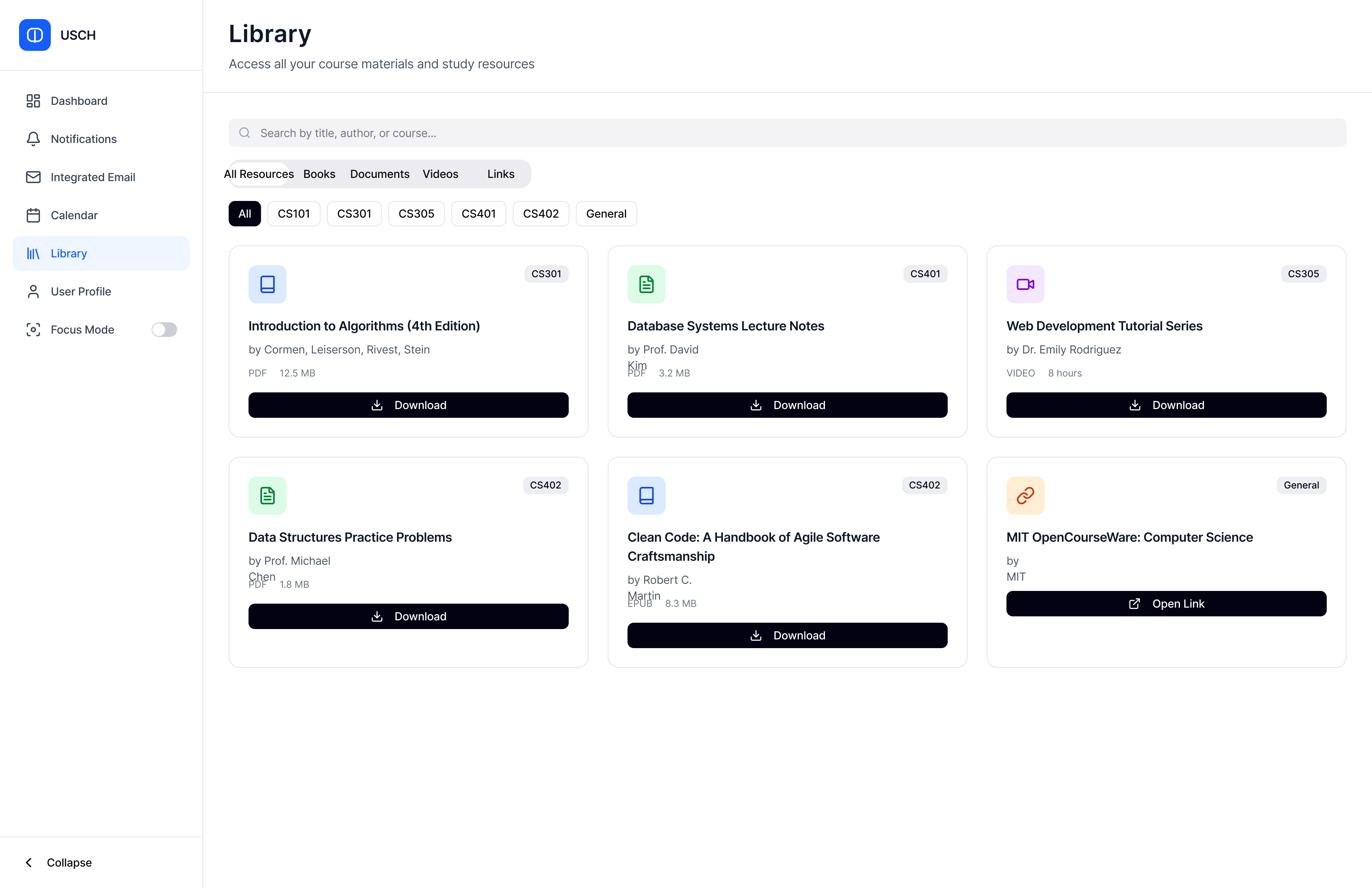
Course Library organised resources by module
Results
Numbers that validated the decisions.
Usability testing with 45 students across two moderated rounds produced consistent results. Zero participants found the interface too complex validating the core principle of clarity over features.
80%
Intend to use regularly
80%
Felt confident using it
Reflection
What I would do differently.
Run Diary Studies, Not Just Interviews
Interviews captured stated pain but not lived behaviour. Diary studies over a week would have caught moments of actual overload in real time far more valuable design data than retrospective recall.
Test Earlier with Lower Fidelity
I moved to mid-fi before testing the lo-fi properly. Navigation decisions challenged in round 2 could have been caught earlier and cheaper with paper prototype testing.
Include Academic Staff as a Persona
The system only works if lecturers actually use it to send announcements. Designing entirely from the student side left important constraints about the sending end unexplored.
Define Success Metrics Before Building
I measured overload reduction and ease of use in testing, but did not define what success looked like before starting design. Pre-set benchmarks would have made the evaluation cleaner and more defensible.
Key Learnings
What the project taught me.
Clarity Beats Features
Users preferred clean and minimal over feature-heavy every time. Visual hierarchy and clear categorisation reduced cognitive load more effectively than adding more controls ever could.
Research Validates Every Decision
Every significant design choice had a direct line back to an interview insight. The ones that did not were the ones challenged in testing. That correlation was not a coincidence.
Integration Is an Architecture Problem
The biggest UX problems were rooted in data architecture decisions. Building a unified inbox means thinking about how different systems talk to each other from day one not as an afterthought.
Anxiety Comes From Caring Too Much
The students who struggled most were not the least organised they were the most committed. Overload is a symptom of engagement, not laziness. That reframe shaped every design decision I made.