Case 02
Design Thinking · Service Design · Team Project
Drip
Circular App
A 12-week design sprint to help a fast fashion retailer enter the circular economy without burning its existing business model. The product problem turned out to be a behavioural one.
The Brief
A product problem that turned out to be behavioural.
Our team of five was asked to design a digital service to help Drip, a fast fashion retailer, enter the circular economy without scrapping its existing business model. That sounds like a product problem. It turned out to be more of a behavioural one.
The gap between what people say they value and what they actually do at checkout is the whole design brief. We spent the first weeks staying in that problem space longer than felt comfortable and the final design is better because of it.
"54% of Gen Z say sustainability matters but rank it below price, fit, and comfort when they buy. 60% say they buy from brands that match their values. Both things are true at the same time. That contradiction is where the design lives."
Two key screens from the hi-fi prototype: AI Styling (left) and the Sustainability Profile dashboard (right).
My Contributions
Four things I owned on this project.
01
Gen Z Secondary Research
Led exploration phase research into Gen Z clothing behaviour and fashion waste. Systematic searches across Statista, Ellen MacArthur Foundation, and Global Fashion Agenda. Three numbers drove most of our design decisions.
02
Mary Persona
Built the Mary persona independently 21, Cork student, compulsive buyer triggered by sales and seasonal events. Designed to represent the users nobody was designing for yet. Building her pushed the team toward Eco Points as a front-and-centre mechanic.
03
QR-Based Digital Passport
Championed this during ideation based on Karen's greenwashing skepticism and the EU's Ecodesign for Sustainable Products Regulation. If transparency is a brand claim, Karen does not believe it. If it is verifiable by scan, she does.
04
Figma Prototyping Co-Lead
Co-led the Figma work from lo-fi sketches through to hi-fi interactive prototype. Key rule: everyone sketched independently before comparing. That gave us genuine design forks to evaluate rather than refining one idea forever.
Research
Three numbers that drove every design decision.
My secondary research surfaced a cluster of Gen Z data points the team kept returning to throughout ideation and prototyping. These were not background context they were active design constraints.
54%
Say sustainability matters
But rank it below price, fit, and comfort. Cotton Incorporated, 2023.
60%
Buy from values-aligned brands
Gen Z who say brand values influence purchasing. Statista, 2024.
71%
Shop primarily on mobile
Gen Z primary channel. Shaped the entire interface direction. HubSpot, 2024.
The Core Insight
Gen Z is not lying when they say sustainability matters. They just will not sacrifice price or convenience for it. The design brief is to make the sustainable choice the convenient one not to make people feel guilty for choosing otherwise.
Persona
Meet Mary. The user most apps forget to design for.
Alexandra (eco-conscious) and Karen (values-driven) were already in the team's thinking. Mary was my addition and she is the one whose behaviour we most needed to understand. Alexandra is already persuaded. Mary is the whole problem.
"I saw a Black Friday discount and just went for it and I didn't really think twice."
Goals
- Find the best deals on trending clothing quickly
- Avoid buying items that won't fit or get worn
- Feel good about purchases without much deliberation
- Donate unwanted clothes with minimal effort
Frustrations
- Regrets impulse buys within days
- Sustainability features feel preachy
- No easy way to verify genuine sustainability claims
- Items frequently don't fit as expected online
Design Implications
- Discounts are the top motivator surface deals prominently
- Frame sustainability as cost-saving, not ethics
- One-tap donate or resell flow post-purchase
- Build trust through verifiable, transparent data
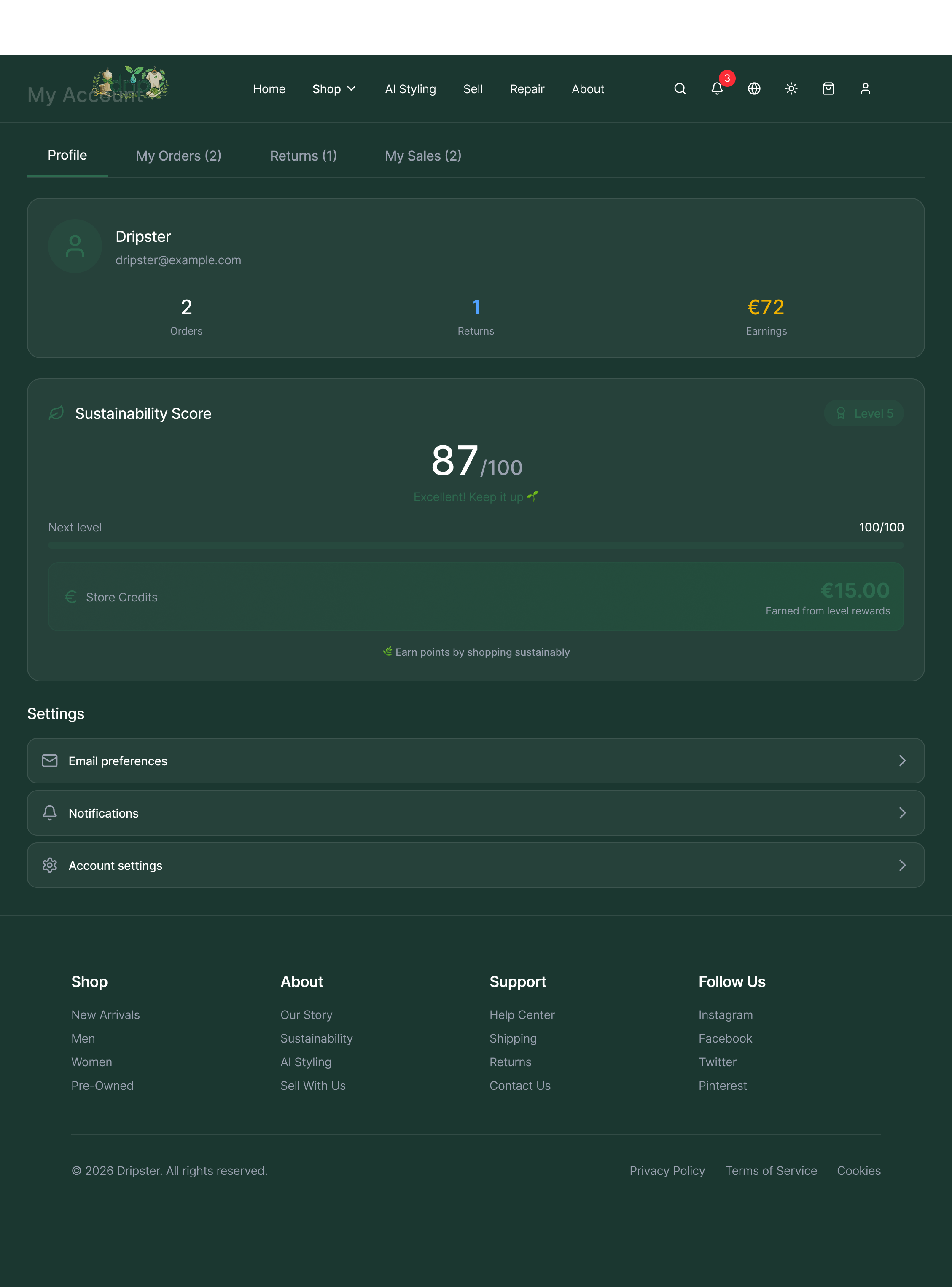
The Profile dashboard shows Mary's Sustainability Score, Eco Points, and store credit earned. Every design decision here maps back to her core motivation: saving money, not saving the planet. Framing sustainability as a financial reward was the key insight from building her persona.
Empathy Mapping
What Alexandra's map taught us about affordability.
Empathy Maps were the most useful tool in the project and the one I least expected to be. Alexandra's map revealed something that completely flipped our affordability conversation.
Says
- Does this brand use organic or recycled materials?
- I would rather buy second-hand than fast fashion
- I try to donate or recycle my old clothes
- I am willing to pay more if it is better for the planet
Thinks
- Seriously considers sustainability when buying
- Frustrated by greenwashing in fashion markets
- Wants to lower personal fashion footprint
- Trying to make ethical choices on a limited budget
Does
- Regularly shops second-hand
- Follows sustainable fashion influencers
- Reads labels to check eco-credentials
- Uses apps to track sustainable fashion choices
Feels
- Proud when making sustainable purchases
- Frustrated by the high prices of sustainable fashion
- Skeptical about vague eco-claims and greenwashing
- Satisfied when extending the life of clothes
The Finding That Changed Everything
Alexandra was not frustrated with Zara. She was frustrated with Patagonia sustainable alternatives priced out of her student budget. That flipped our whole conversation: we stopped treating low prices as a constraint on sustainability and started treating them as the point.
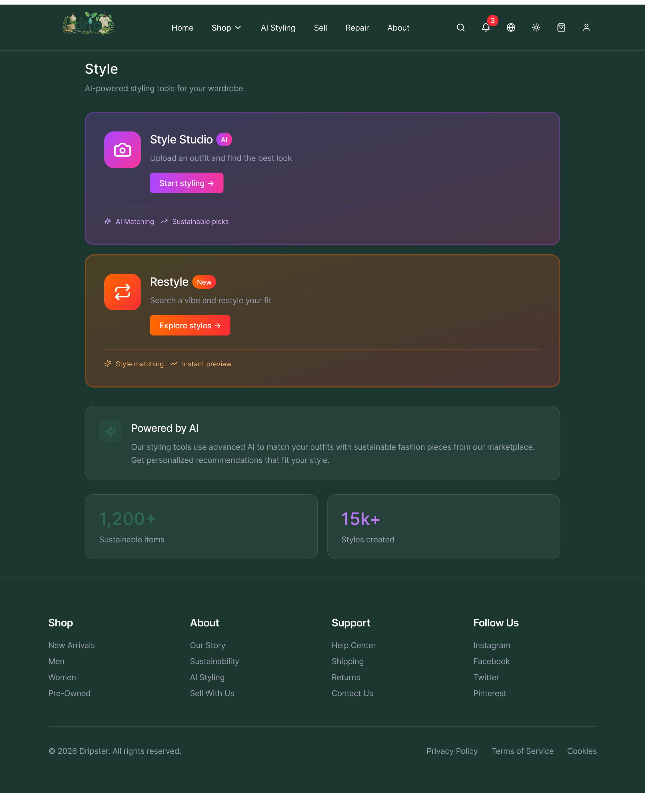
AI Styling directly addresses what Alexandra's empathy map revealed. She wanted sustainable fashion but could not afford Patagonia prices. Style Studio surfaces affordable sustainable alternatives matched to her existing wardrobe — solving the price barrier without asking her to compromise on style.
Key Feature
Verifiable transparency beats brand claims every time.
During ideation I pushed for what became the QR-based Digital Passport. The idea came from two places: Karen's greenwashing skepticism surfaced in empathy mapping, and the EU's Ecodesign for Sustainable Products Regulation which will require Digital Product Passports for textiles sold in the EU.
"If transparency is a brand claim, Karen does not believe it. If it is verifiable by scan, she does."
A shopper scans a QR code and gets origin, materials, and an environmental impact score. That is a different thing from a sustainability pledge in an Instagram caption. A compliance cost for slow movers is a competitive edge for whoever gets there first.
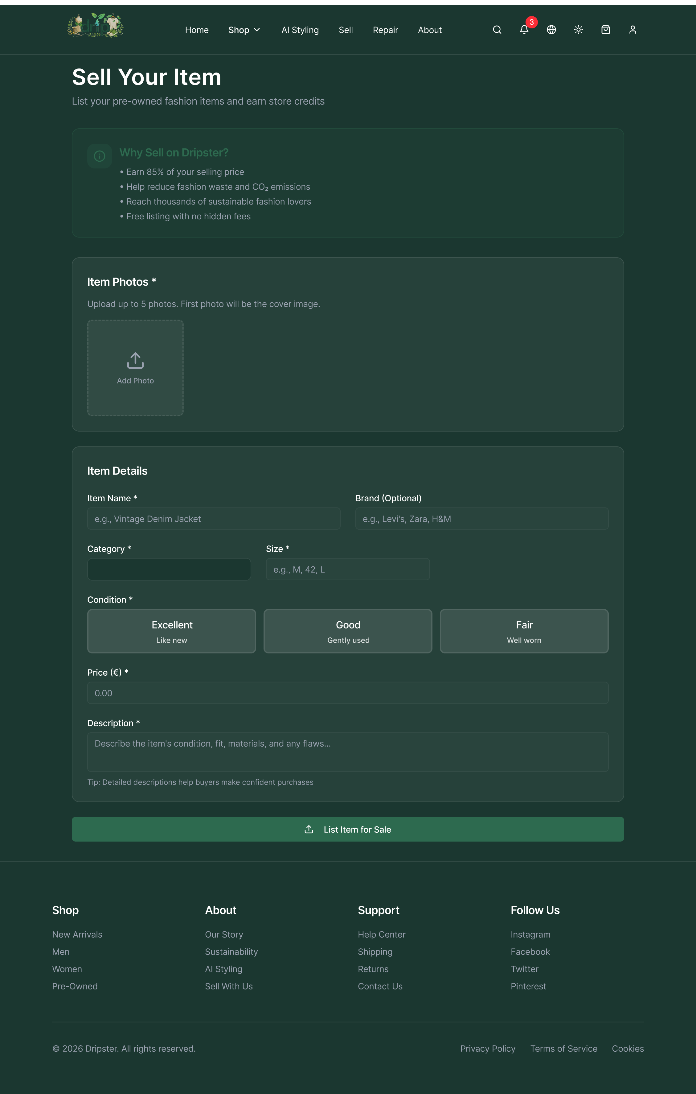
The Sell screen applies the same transparency principle as the QR passport. Condition grading (Excellent, Good, Fair), accurate descriptions, and verified earnings make every transaction trustworthy. This is what Karen needed to believe the platform was genuine.
Design Process
Lo-fi to hi-fi. With one important rule.
We co-led the Figma prototyping work. The rule that made it work: everyone sketched independently at lo-fi before comparing. Two features that were not in the lo-fi emerged at mid-fi wardrobe tracking and a gamified CO2-saved dashboard. Both came from asking what would bring Mary back to the app after her first purchase.
AI Styling emerged at mid-fi stage, not lo-fi. Asking "what brings Mary back between purchases?" unlocked it. Independent sketching before group comparison meant this idea survived on its own merits, not because it was said first in the room.
"Once you can tap through screens in a browser, the whole team talks differently about the service. You stop saying the app would show and start pointing at specific things on screen."
The App
Features designed to change behaviour, not describe values.
Every feature was designed to serve Mary's actual motivations not Alexandra's stated values. That distinction shaped every decision about what made the final cut.
01
QR-Based Digital Passport
Scan any clothing tag to get origin, materials, and an environmental impact score. Verifiable data, not brand claims. Built ahead of EU Ecodesign compliance requirements.
02
Eco Points and Store Credit
Return, donate, or resell items to earn Eco Points redeemable as store credit. Sustainability framed as money saved not moral credit earned. Mary's primary motivation is always cost.
03
Wardrobe Tracker
Scan existing clothes to build a digital inventory with a per-item sustainability score. Designed to bring users back between purchases building the habit before changing the behaviour.
04
Constructive Friction
A sustainability score visible before purchase, plus a short cooling-off pause on impulse buys. Intentional friction not bad UX. The opposite of a dark pattern is intentional design.
05
Gamified CO2 Dashboard
Visual progress tracker showing CO2 saved, clothes diverted from landfill, and next reward milestone. Makes abstract environmental impact feel immediate and personal for Mary.
06
One-Tap Resell and Donate
Post-purchase flow for unwanted items frictionless resell or donation with minimal steps. Designed for Mary who already donates some clothes but specifically bins fast fashion.
Left: Sell Your Item — 85% earnings, free listing, condition grading. Right: Sustainability Score — gamified CO2 tracking, level progression, and store credits. Both features speak to Mary in her language: money saved and rewards earned.
Tool Evaluation
What worked and what needed rethinking.
Not every design thinking tool was equally useful. Being honest about what worked and why is more valuable than listing everything used.
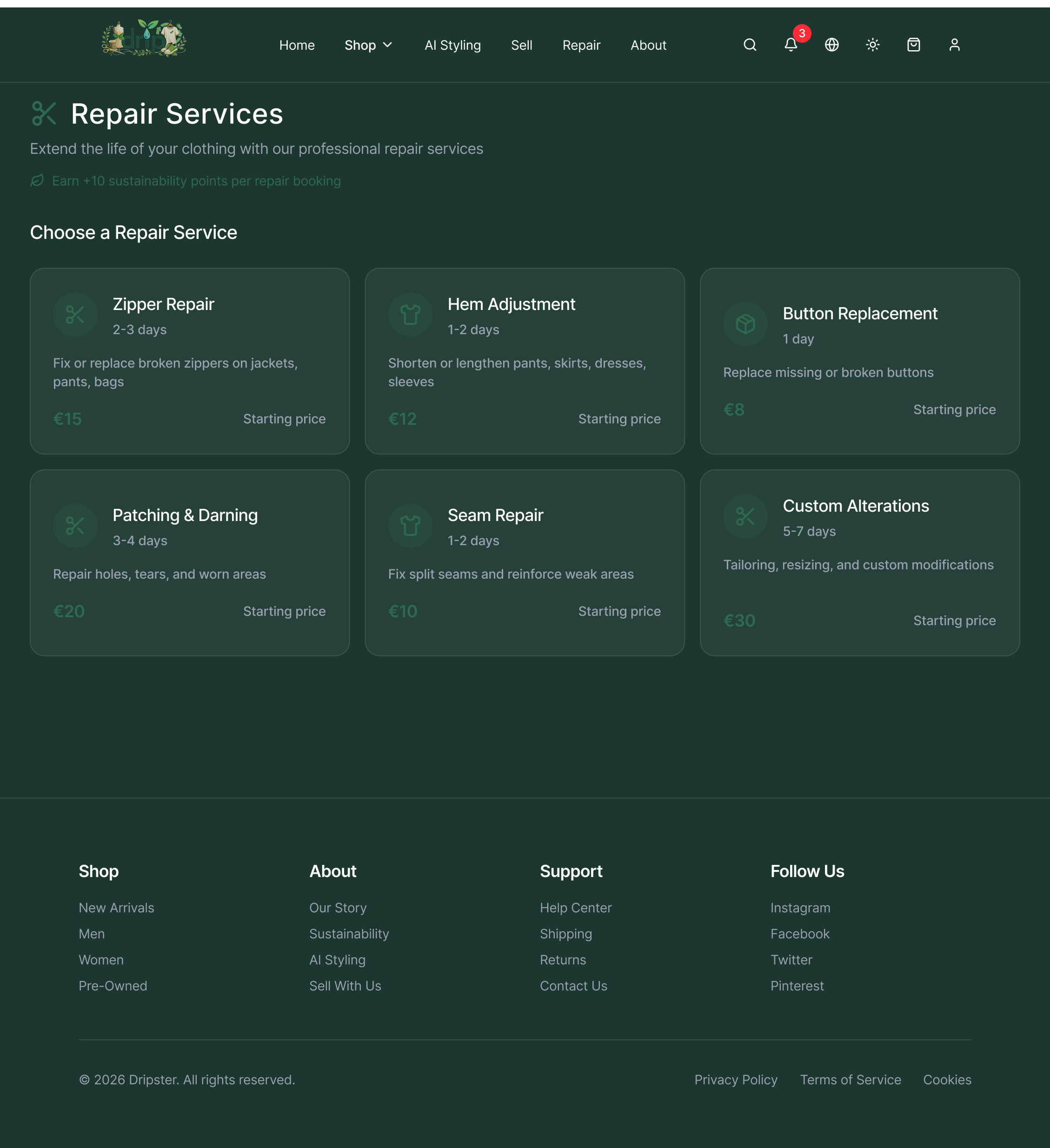
Repair Services — the feature our customer journey map failed to detail. Six options from €8 Button Replacement to €30 Custom Alterations. A proper sub-flow map would have revealed the anxiety of posting a garment to a stranger, which our five-stage overview completely glossed over.
Reflection
What I would do differently.
Define the Analysis Framework Before Sending the Survey
We ran a 26-question survey with no pre-agreed analysis plan. When results came back the synthesis was chaotic. Never send a survey without a coding framework already written.
Detail the Repair Booking Flow Specifically
The customer journey map stayed too high-level. Detailing the repair booking sub-flow would have surfaced specific friction points like the anxiety of posting a garment to a stranger.
Draw the Service Boundary Before Mapping Stakeholders
Cattle farmers ended up on the stakeholder map. Define scope first, then map inward from there.
Test the Refundable Deposit Model with Users
My deposit model idea was rejected in team discussion as feeling punitive. It should have been tested with a low-fidelity prototype before discarding. Good ideas die in conference rooms all the time for the wrong reasons.
Key Learnings
What I am taking from this project.
Stay in the Problem Space
My instinct is to arrive at a positioning statement fast and start executing. This project required the opposite. The Mary persona, the value-action gap insight none of those would have happened if we moved to solution mode in week two.
Constructive Friction Is Ethical UX
E-commerce UX is built almost entirely around removing friction from the path to checkout. That keeps users like Mary in regret cycles. The opposite of a dark pattern is not neutral design it is intentional design.
Design Thinking Transfers Directly to Marketing
The empathy map I built for Alexandra trained me to look for value-action gaps and those exist in SaaS buyers just as much as in fast fashion shoppers. Different context, same mechanism.
Visual Language Lowers Participation Barriers
Our team had different academic backgrounds and varying English fluency. Visual artefacts democratise collaboration in a way that verbal-only approaches do not.